Super.com
2024
Product Design · Mobile App
What happens when a revenue stream exists — but the product isn't ready for it?


01 — Context
A revenue stream with nowhere to land.
Super.com is a fintech super app trusted by over 7 million users — built for the 183 million Americans with low-to-medium credit scores — to save on travel, build credit, and access cash advances. In late 2023, they identified a new opportunity: let users earn real money through games, tasks, and surveys — potentially $400+/month. The business case was clear. The product experience wasn't. I led the end-to-end design of the Earn Tab: a dedicated hub that turned a scattered, overlooked feature into a daily habit.

02 — My Role
End-to-end ownership, from first insight to final metric.
Sole designer on a cross-functional team (1 PM, 6 engineers). I owned the full process — research, strategy, delivery, and post-launch iteration — in collaboration with a UX Researcher.
01
Research
SUS Score survey (n=77)
Naming survey (n=113)
User interviews (n=8)
Stakeholder interviews (n=5)
02
Diverging
User flow
User profile definition
Workshop with stakeholders
Lo-fi wireframes
03
Converging
Product Design workshop
Visual designs
Internal usability testing
Product Requirements Doc
UX Research
Product Strategy
Information Architecture
UI Design
Prototyping
Usability Testing
03 — The Problem
The old Earn Tab wasn't earning its place.
We ran user interviews, session recordings, and a SUS survey — which returned a score of 52/100, classified as "Poor." Four patterns kept surfacing:
01
Buried inside Travel
Earning features lived inside the Travel flow — invisible to anyone not booking a trip.
02
A single-source mental model
Users associated Rewards only with hotel stays. There was no signal that earning opportunities had expanded.
03
Redemption was a mystery
50% of users didn't know they could redeem rewards directly to their Super.com Card — not just as travel credits.
04
No reason to come back
Earning was tied to travel bookings. Between trips, there was nothing to come back for — killing retention.
System Usability Scale score before the Earn Tab launch
Unaware they could redeem rewards to the Super.com Card
Unaware of how to earn rewards through the app
04 — Before / After
The same product. A completely different experience.
Before
Tab called "Rewards" — tied to travel perks
Games, surveys, and tasks had no home
No dedicated Earn section in navigation
Balance buried in account settings
No redemption shortcut visible
Outdated UI — pre-dating the new Design System
After
New tab name reflecting the expanded feature set
Unified hub for games, surveys, and tasks
Earn Tab as primary nav destination
Earnings balance prominent at top
One-tap redemption from the Earn Tab
First screens built on the new Design System


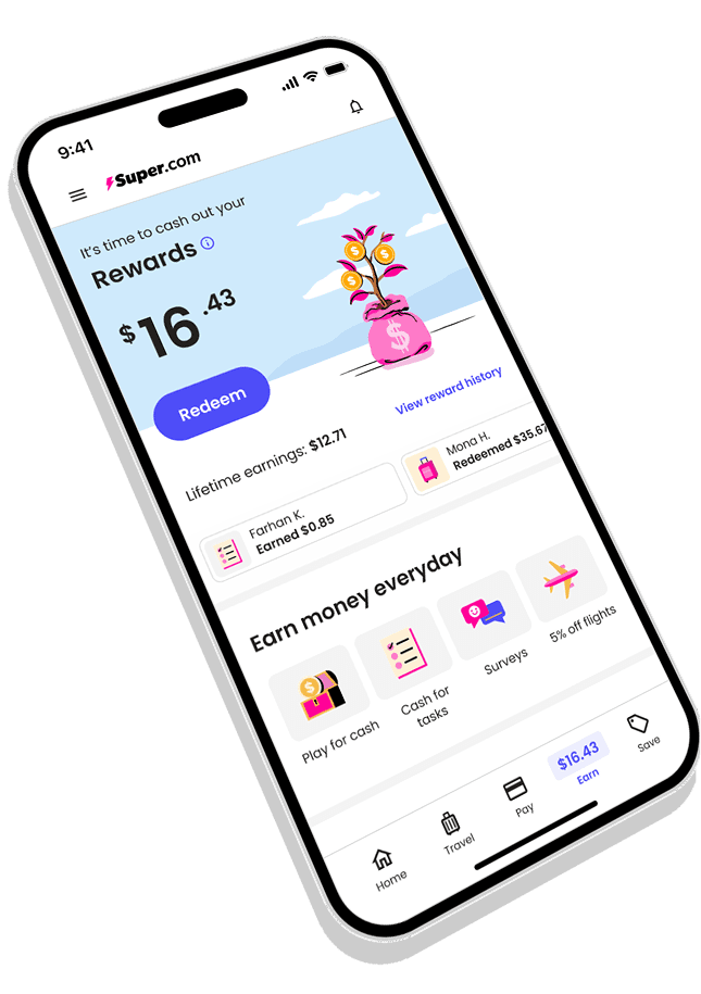
05 — The Solution
Designed to be used every day.


The tree grows as the user engages — turning earning into a habit with visible progress.


A unified hub surfaces all earning types. One tap opens the game — no dead ends.


Full earning history, and a clear redemption moment — cash to the Super.com Card in one tap.
06 — Impact
Four metrics. All statistically significant.
+8.6%
D1 redemptions for Super.com card users
95%+ stat sig
+23.8%
D1 redemptions for Travel users
95%+ stat sig
+24.9%
M1 engagement on surveys and games
95%+ stat sig
+7%
M1 Super.com card conversion rate
95%+ stat sig
"Gustavo's ability to translate complex business goals into elegant, user-centered solutions is remarkable. The Earn Tab was one of the most impactful projects of the year."
Yanick Jimenez
Senior Product Designer